
What a catering website needs before the enquiry form
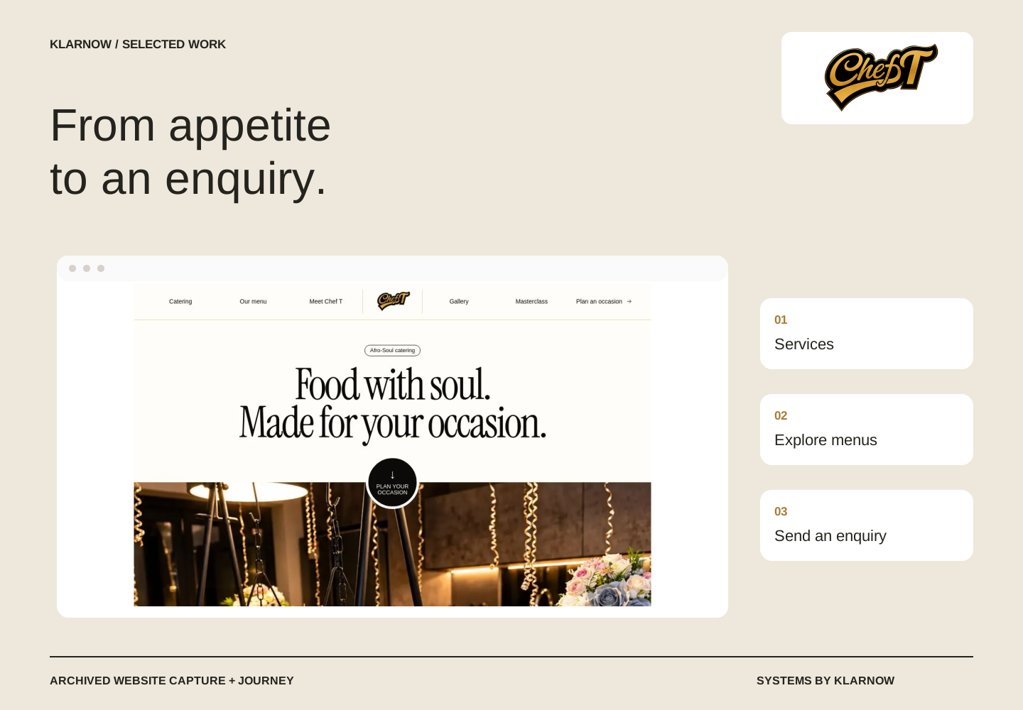
Chef T’s website case explores how service structure, menus and a clear enquiry route help customers understand the catering offer.
The useful answer
A catering website should help someone understand the service, explore the menu and make a purposeful enquiry. Chef T’s published website shows Klarnow’s approach to connecting those decisions, without treating an enquiry as an automated order or confirmed booking.
The customer is making several decisions
A visitor rarely arrives with a fully specified catering brief. They may be exploring a type of event, comparing food options or trying to understand whether the business offers the service they need. A general contact button asks them to start a conversation before those basic questions have been answered.
The Chef T case centres on making the offer understandable before the handoff. The website’s job is to connect service discovery, menu information and the route into an enquiry. That gives the customer a clearer purpose for making contact and gives the business a better starting point for a response.
Klarnow’s contribution
Klarnow shaped the public website and customer enquiry journey around the catering offer. The published site demonstrates the service, menu and enquiry experience. This is the supported delivery outcome. It does not establish automated payment, fulfilment, confirmed orders or increased revenue.
That boundary matters because catering enquiries and direct food orders require different decisions. A customer requesting a service may need availability and scope confirmed before a quote can be agreed. A menu-led purchase may need a defined checkout and fulfilment flow. The interface should explain which journey the customer is entering.
Make the next question easier
For a catering business reviewing its own website, start with what the team repeatedly asks after an enquiry arrives. Event type, approximate numbers, location and timing may be useful examples, depending on the service. These are illustrative planning prompts, not a description of fields independently verified on Chef T’s form.
Then look at the pages before that form. Do they explain what is offered, show relevant menu information and make the enquiry action visible? The point is not to collect every possible detail at the first touch. It is to provide enough clarity for a meaningful first response without making the customer complete a full operational brief.
Keep enquiry and booking separate
A useful service journey explains what happens after contact. If availability or a tailored quote requires review, the confirmation should reflect that. The team also needs an agreed place to see the request and record its next action. These are important checks for the wider system, even when the immediate project is the website.
The Chef T case shows a published service website organised around the customer’s next decision. The practical lesson is to make appetite, offer and action work together. More complex ordering and payment connections should be scoped and tested as their own delivery, rather than implied by a polished public page.
The documented position
The public Chef T website demonstrates the service, menu and enquiry experience.
A published enquiry journey is not evidence of automated payment, confirmed orders or increased revenue.
Source basis: published Chef T website and the Klarnow food-system project record, reviewed October 2026.
What to take from this
If customers keep asking what you offer before they can enquire, improve the service and menu journey before adding more form fields.